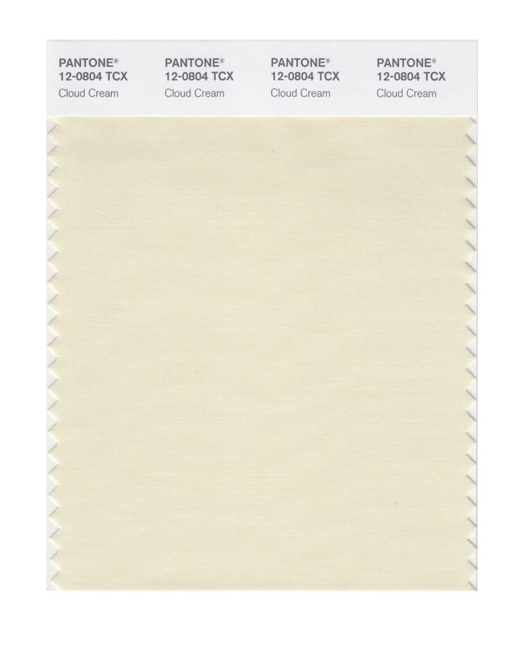
If you’re looking for a versatile and timeless color that can add warmth and sophistication to your design projects, you might want to consider Pantone 7500C Beige. This muted and creamy shade of beige is part of the Pantone color system, which is widely used in the design and printing industries to ensure consistency and accuracy of color reproduction.
What makes Pantone 7500C Beige special?
While beige is often associated with neutrality and blandness, Pantone 7500C Beige has a subtle and elegant character that can enhance different color combinations and design styles. This beige has a slight yellow undertone, which gives it a hint of warmth and luminosity. It’s also a mid-range beige, which means it’s not too light or dark, and can work well as a background or accent color.
Some of the other qualities that make Pantone 7500C Beige stand out are:
- Timelessness: Beige has been a popular color for centuries, and it never seems to go out of fashion. It can work well in traditional, modern, or eclectic designs, and can create a sense of calmness and elegance.
- Compatibility: Pantone 7500C Beige can harmonize with a wide range of colors, from pastels to jewel tones, and from cool to warm hues. It can tone down bright colors or amplify subtle ones, depending on the context.
- Versatility: Pantone 7500C Beige can be used in a variety of design projects, such as branding, packaging, web design, interior design, fashion, and more. It can convey different moods or messages, depending on the audience and the purpose.
How to use Pantone 7500C Beige in your designs
There are many ways to incorporate Pantone 7500C Beige into your designs, depending on your creativity and your goals. Here are some suggestions:
Pair it with contrasting colors:
To create a dynamic and eye-catching color scheme, you can combine Pantone 7500C Beige with colors that are opposite or complementary to it on the color wheel, such as:
- Blue: a cool and soothing color that can balance the warmth of beige and create a classic and preppy look.
- Green: a fresh and natural color that can evoke a sense of growth, harmony, and prosperity.
- Pink: a soft and romantic color that can add a feminine touch and create a dreamy and delicate atmosphere.
- Brown: a rich and earthy color that can reinforce the organic and natural qualities of beige and create a warm and rustic ambiance.

You can use these colors in different proportions, depending on the hierarchy and contrast you want to achieve. For example, if you want to highlight a call-to-action button or a headline, you can use a brighter or darker version of the contrasting color, and use Pantone 7500C Beige as the background or the border.
Use it as a base color:
If you want to create a design that feels cohesive and elegant, you can use Pantone 7500C Beige as the main color, and add other colors in small doses or in variations of the same hue. This approach can work well for branding, packaging, or web design, where you want to create a recognizable and consistent look.

To create contrast and hierarchy, you can use different shades of beige, or add some texture, pattern, or gradient to the design. You can also play with the typography, using different fonts, sizes, and weights to create emphasis and hierarchy.
Conclusion
Pantone 7500C Beige is a versatile and timeless color that can add warmth and sophistication to your design projects. It has a subtle and elegant character that can enhance different color combinations and design styles. Whether you use it as a base color or a contrasting color, Pantone 7500C Beige can create a sense of calmness and elegance, and can work well in different contexts and for different audiences. So why not give it a try and see how it can elevate your designs?
If you are searching about PANTONE SMART 14-1012 TCX Color Swatch Card | Pantone Champagne Beige you’ve visit to the right page. We have 10 Images about PANTONE SMART 14-1012 TCX Color Swatch Card | Pantone Champagne Beige like Pantone palette, Beige color palette, Pantone colour palettes, Pin on Pantone colors and also Die besten 25+ Beige pantone Ideen auf Pinterest | Paint color swatch. Here you go:
PANTONE SMART 14-1012 TCX Color Swatch Card | Pantone Champagne Beige

www.oprny.com
beige color champagne pantone 1012 swatch tcx smart card
Pantone Beige | Pantone Colour Palettes, Pantone, Pantone Palette

www.pinterest.de
pantone tcx
Pantone 7500C Beige | Farbe | Pinterest | Pantone

www.pinterest.com
pantone 7500c
Die Besten 25+ Beige Pantone Ideen Auf Pinterest | Paint Color Swatch

www.pinterest.de
pantone hyatts
Pantone Gilded Beige | Pantone Colour Palettes

www.pinterest.com
pantone beige sage color palette colour desert maple sugar colors green tcx pallete gilded choose palettes chart board
19 Best BEIGE PANTONE Images On Pinterest | Colour Pattern, Color

www.pinterest.com
pantone beige light color cream swatches swatch colour smart blue
Pantone Palette, Beige Color Palette, Pantone Colour Palettes

www.pinterest.ca
nuancier tcx cor buttercream palettes pms échantillons novio pervertido paleta coreano décoration neutre abeille rétro breuer
Pin By Bea & Bloom | Design & Illustr On Pantone | Pantone Colour

www.pinterest.com
pantone palettes swatch
Pin On Pantone Colors

www.pinterest.com.mx
palettes schemes buff kleurkaarten pallete paletas tpx cappucino nuancier kleurstellingen paleta
Beige Sublime. In 2019 | Pantone Colour Palettes, Beige Color Palette

www.pinterest.es
pantone sublime
Pin by bea & bloom. Pantone palette, beige color palette, pantone colour palettes. Pantone smart 14-1012 tcx color swatch card
 markanthonystudios.net Mark Anthony Studios Site


